在之前提到的项目中需要用到进度条的设计,于是又去重温
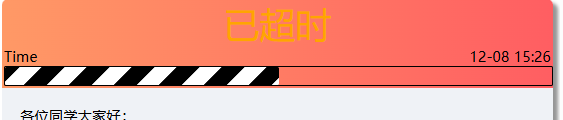
所需效果如上图,代码如下:
<div style="width: 100%;border:2px solid;border-radius: 2px;">
										<div class="progress"></div>
									</div>

<style>
.progress
{
	border-radius: 2px;
	width:50%;
	height:20px;
	background-size: 50px 50px;
	background-image:linear-gradient(-45deg,black 0,black 25%,white 0,white 50%,black 0,black 75%,white 0,white 100%);
	animation:progress-bar 10s infinite linear;
	-webkit-animation:progress-bar 10s infinite linear;/* Safari and Chrome */
}

@-webkit-keyframes progress-bar /* Safari and Chrome */
{
	from {background-position:0 0;}
	to {background-position:600px 0;}
}

@keyframes progress-bar
{
	from {background-position:0 0;}
	to {background-position:600px 0;}
}

</style>上述代码参考自https://blog.csdn.net/Rao_Limon/article/details/88176537
以上代码已经初步实现了进度条的功能,只需调整width参数便可以决定进度条的长度。但我想实现的是能够显示已经过去的时间的比例,于是与php结合下有了如下代码。
<php
……
$dateddl = $data['ddl'];
$datest = $data['start_time'];
$progress =round( (time() - strtotime($datest))/(strtotime($dateddl) - strtotime($datest)) ,2);//计算流逝时间的比例并保留两位小数
if($progress >= 1) {
    $progress = 1;
}elseif ($progress <= 0) {
    $progress = 0;
}//排除未开始和超时的情况
$progress = $progress*100;//百分比
……
echo '<div style="width: 100%;border:2px solid;border-radius: 2px;">
   <div class="progress" style="width: '. htmlspecialchars($progress).'%"></div>
</div>';
……
?>